Design Museum, LondonThis astounding exhibition reveals the obsessive level of genius the great director showed, whether inventing the space age or restaging the Vietnam war in a London gas works

A photograph of a rambling snow-covered hotel in Oregon is on display in the Design Museum, annotated with the energetic scribbles and emphatic instructions of film director Stanley Kubrick. After sending his set designer to scour America for locations, he had finally settled on the building he would use as the exterior of his haunted hotel in The Shining. Labels stuck liberally across the image explain exactly how he wanted the curving path through the snow to appear in the shot, along with a characteristically stern warning: THERE IS NO OTHER WAY TO DO IT, REPEAT NO OTHER WAY. Exercise the greatest care as the compositional effect of a different path might be BAD BAD BAD.
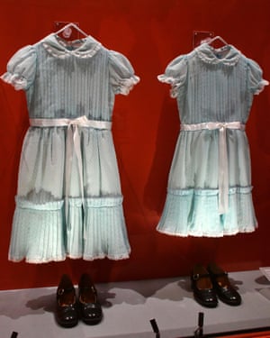
The photograph provides a glimpse of the obsessive attention to detail and relentless perfectionism that Kubrick brought to his films, a method of total control vividly depicted in this new blockbuster exhibition on his life and work. Featuring over 500 objects from Ken Adams sketches for the War Room in Dr Strangelove, to erotic furniture from the Korova Milk Bar in A Clockwork Orange the show plunges the visitor headlong into Kubricks meticulous, and often disturbing, mind, revealing how he constructed entire worlds from scratch to tell his stories.

The first step was always research, and lots of it. Kubrick would spend years immersing himself in the subject at hand until he knew every detail about the characters, events and scientific phenomena he was portraying. As a section on his (unrealised) Napoleon film shows, he produced an index card for every day of the French emperors life, with notes about his activities, even down to menu choices. It was an analogue Wikipedia, says curator Deyan Sudjic.
Sometimes Kubricks level of knowledge would land him in trouble. The interiors of the war planes in Dr Strangelove were so detailed that he was suspected of spying. Production designer Ken Adam recalled that American military personnel visited the set and were terrified by the amount of accuracy we had in this aircraft. We received a memo saying: You had better make sure you know where your references come from or else you might be investigated by the FBI.
Through the reams of correspondence, sketches, props and notes on show, Kubrick emerges as an omnipotent figure, enjoying complete control over every aspect of his productions, from the design of costumes to promotional posters as well as an enviable ability to extend both deadlines and budgets. Notes show him haranguing Saul Bass over his designs for The Shining poster (Hard to read, even at this size Hotel looks too sprawling), and tweaking the fabric choices of Hardy Amies costumes for 2001: A Space Odyssey. The genius of the sci-fi films design was that it suggested a plausible future without veering off into fantasy. As Kubrick said of the costumes: The problem is to find something that looks different and that might reflect new developments in fabrics but that isnt so far out as to be distracting Certainly buttons will be gone. Even now, there are fabrics that stick shut by themselves.

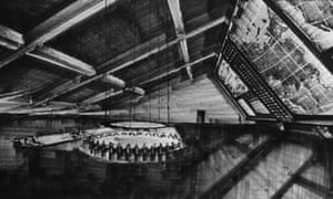
The section of the exhibition devoted to 2001 regarded by many as Kubricks crowning achievement is a thrill, featuring original artwork, model spaceships, costumes and props galore. It includes a miniature mockup of the groundbreaking centrifuge set, a huge 12m-high hamster wheel that allowed scenes to be shot that appear to show the astronauts walking upside down (and which took British manufacturer Vickers-Armstrong six months and more than 580,000 to build).
Like every element of the epic film, it gave as accurate a representation as possible of what form the future of space travel might take, based on ideas developed by German rocket scientist Wernher von Braun for a giant spoked wheel that would have rotated around its axis to create artificial gravity for its occupants. Kubrick enhanced the sense of believability through familiarity, using a prodigious amount of product placement, from a Pan Am space shuttle to an Orbiter Hilton Hotel and an IBM tablet preceding the iPad by 40 years.
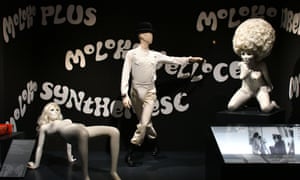
He had a keen sense of the latest contemporary design and technology, and often exploited its seductive power on film. There is a sexiness to beautiful machines, he said, the smell of a Nikon, the feel of an Italian sports car or a beautiful tape recorder. This fetishistic attitude to objects comes through in A Clockwork Orange, where the interiors are furnished with pieces that were commercially available at the time but unusual enough to give a sense of the near future. The protagonists bedroom features a scarlet Olivetti typewriter designed by Ettore Sottsass, alongside Herman Makkinks Christ Unlimited sculptures and a futuristic transparent Transcriptor record player, designed by David Gammon.

But the polished results were rarely achieved without hiccups. The interiors of the milk bar, where the film opens, were originally going to be designed in collaboration with artist Allen Jones, whose provocative furniture made from submissive female mannequins had caught Kubricks eye. Jones even got as far as designing the waitresses uniforms for the film, conceiving skintight lycra dresses with windows cut around the bottom. I wanted a waitress costume that reflected the fact that, when bringing food, she is functional, and when departing she is decorative, he said. The two maestros couldnt agree on a fee, and so Joness work like so many of the carefully prototyped designs elsewhere in the exhibition was canned.
Perhaps the most striking thing that resurfaces throughout the show is how much of the immense trouble that Kubrick went to (and forced others to go through) was undertaken in order to avoid travelling. Despite having had a pilots license in his youth, he was scared of flying, so the vast majority of his films were shot in the UK. If he wouldnt travel then the world would be brought to him, at astonishing lengths.
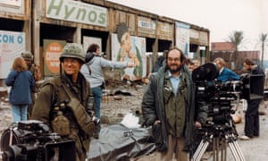
For his celebrated 1987 war film, Full Metal Jacket, Kubrick hired Royal College of Art architecture graduate Anton Furst to transform Beckton Gas Works in London into the Vietnamese city of Hu, using 200 living palm trees flown in from Spain and 100,000 plastic tropical plants from Hong Kong. The Parris Island training camp, meanwhile, was pieced together from a Territorial Army barracks in Bassingbourn, an abandoned airfield in Enfield and an army latrine at Shepperton Studios. Photographs show how Furst proposed to transform Becktons 1930s concrete relics into a vaguely southeast Asian-looking cityscape with strategic demolitions and additions.

For his final film, Eyes Wide Shut, Kubrick attempted to recreate New Yorks Greenwich Village from a collage of streets in London. He dispatched his brother-in-laws son to assiduously photograph the entire length of Commercial Road, and created a surreal map of Manhattan, labelling each area with the London streets that could be used as stand-ins. It was a jigsaw approach he had used for his 1975 period drama, Barry Lyndon, when, after his team had searched England, Ireland and Germany to find the perfect stately home, they eventually pieced a mythical house together from 12 different sites. He kept changing his mind, and I was racing around the Irish countryside trying to find locations, recalled Ken Adam. When he didnt like the location, the whole thing would have to be shot again It was a disaster.
Kubricks uncompromising fastidiousness drove many of his collaborators mad, but most agreed that it was usually worth it for the quality of the final product. As Sydney Pollack put it in a 2012 documentary: Perfectionist is usually a euphemism for pain in the ass. Stanley was the first real perfectionist.


Recent Comments