From his provocative Louvre pyramid to his inverted wedge for Dallas, the Chinese-American architect was too modern for his time but his angular marvels look perfect now

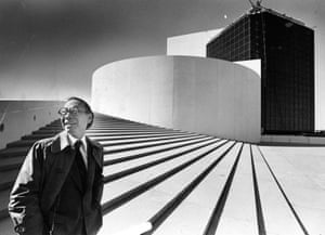
So bold were IM Peis designs, they were often regarded as wilfully controversial, designed to shock. But Pei himself never saw it like that. He was possibly the last living link to such founders of modernism as Le Corbusier and Bauhaus stalwarts Walter Gropius and Marcel Breuer, all of whom he met. He carried their torch, abiding by their principles and adding flourishes of his own usually too many for the general public. To those modernist foundations of proportion, simplicity, geometry, Pei added audacious angles and structural daring. The result is a body of work that is instantly recognisable more so than their retiring creator, who died this week aged 102.
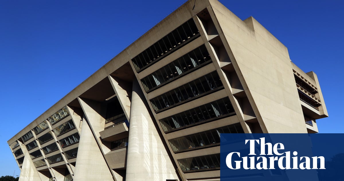
Peis Dallas Civic Center was a statement of intent. Commissioned as part of a drive to rebrand the city following the assassination of President John F Kennedy, it was a statement of civic grandeur with more than a touch of sci-fi. It was later used as a location in the movie RoboCop. Its huge, inverted wedge of office floors looked too precarious in early designs: Pei had to express the stairwells as cylindrical columns, to give the impression they were holding up the seven-storey overhang when in fact they served no structural purpose.

Pei, a Chinese-American, undoubtedly designed the building for dramatic impact, but only as a statement of public pride. The overhang had some practical purpose, too it shaded the sun; and he put most of the workers upstairs, so as to make the ground floor public space. And, as with so many Pei buildings, it makes absolute sense when seen both in relation to its surroundings (Pei wanted to create a civic counterpoint to the commercial high rises of downtown Dallas) and from the inside, where its somewhat bulky form opens out into an open, light-filled atrium space.
Pei never shied away from a good contrast. He would have more clashes throughout his career, though the rising prestige of commissions indicates there were patrons who got it. His design for Kennedys presidential library initially featuring a glass pyramid was considered too intrusive for its original site, close to Harvard, his alma mater. It had to be moved to a less-than-ideal spot at Bostons Columbia Point. His 1978 extension to Washington DCs National Gallery of Art took the opposite tack to the neoclassical original, with a plain, sharp-edged monumental companion, and a spacious, light-filled lobby at its centre. Again, what appears to be jarring proves to be respectful, practical and mindful of its site.
It was a similar story with his Louvre extension in Paris, though it took Parisians longer to appreciate it. Peis glass pyramid was denounced for nearly a decade before it opened and for many years after. It was considered a sacrilege on the 17th-century palace, a symbol of death, a monument to President Franois Mitterrand, an occult power centre for the Illuminati/Satan/Dan Brown, a foreign intrusion, a modernist intrusion.
In fact, Peis extension went out of its way to avoid interfering with the original building. The form of the pyramid itself attracted the uproar; less attention was paid to what it did, which was to reconfigure the gallerys entrance and circulation system to accommodate the swelling number of visitors, and to provide access to the Louvres galleries from underneath, thus taking some of the strain off the precious palace itself.
And it did the job beautifully, as visitors discovered once they got inside after an hour or two of queuing. Added to which, before the pyramid arrived, the Louvres courtyard the Cour Napolon was being used as a car park for the finance ministry. True, the eventual pyramid was not as transparent as originally advertised, but as a statement of bold, high-tech modernity in the heart of a historic jewel, it was very much in keeping with Pariss postwar reinvention.

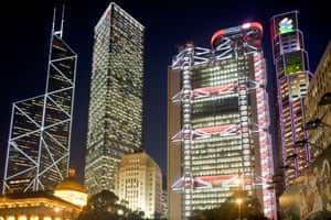
If I had to pick a personal favourite, it would be Peis Bank of China HQ in Hong Kong one of the greatest, boldest, most distinctive skyscrapers ever designed, and a building that still looks as if it has been teleported in from the future. In many ways it had: a future where China was the economic superpower it is today. At 72 storeys, it was the tallest building outside the US when it opened in 1990. It dwarfed it surroundings and upstaged its neighbour and rival: the expensive, British-owned Hongkong and Shanghai Banking Corporation headquarters, designed by Norman Foster.
The Bank of China tower looks even taller than it is: the combination of huge diagonal megastructure and minimal, graph-paper glazing makes its scale somehow impossible to judge. Beautifully simple, it looks more like a giant, abstract sculpture than a working building. But it is practical, too: the structure uses half the steel of conventional skyscraper; added to which, it conceals a sequence of spectacular atrium spaces. As a nod to the buildings innate Chinese-ness, Pei claimed to have modelled its form on the growth of bamboo. I prefer to think of it as four Toblerone bars of varying height, although the buildings feng shui was apparently terrible for its neighbours.
It was never form for forms sake with Pei. Wherever he built, he adapted his language to the context and the purpose. Unlike some latterday arch-modernists (Richard Meier, say), he remained supple and versatile. His 1963 Luce Memorial Chapel in Taichung, Taiwan, is a graceful tent of overlapping curved planes. Thirty years later, he was designing the RocknRoll Hall of Fame in Cleveland.

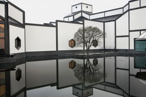
His Suzhou Museum, in east China, reinterpreted the citys black-and-white vernacular, while his Miho Museum in Japan respected Shinto tradition and modestly sunk itself into the landscape. His last great work, the Museum of Islamic Art in Qatar, opened in 2008, and incorporates Islamic design traditions yet remains, unmistakably, a Pei building.
Beneath the adventurism, Pei was always considerate, sensitive and wise. At the beginning of his career, he was too modern for his time. At the end of it, viewed from the perspective of our time, it all looks just right.


Recent Comments